
Mateina
Mateina — Yerba Mate Packaging & Brand Design
Better Energy
Starts Here
Mateina starts with the tradition of Argentine yerba mate and brings it to today’s shelves. As Mateina grew, we focused on making the packaging more durable and ready for larger stores. Through it all, we made sure the brand’s personality stayed clear.
Consumer / Food and Beverage
Industry
2024 - Present
Year(s)
Art Direction
Packaging
Retail
Social
Campaign
Services
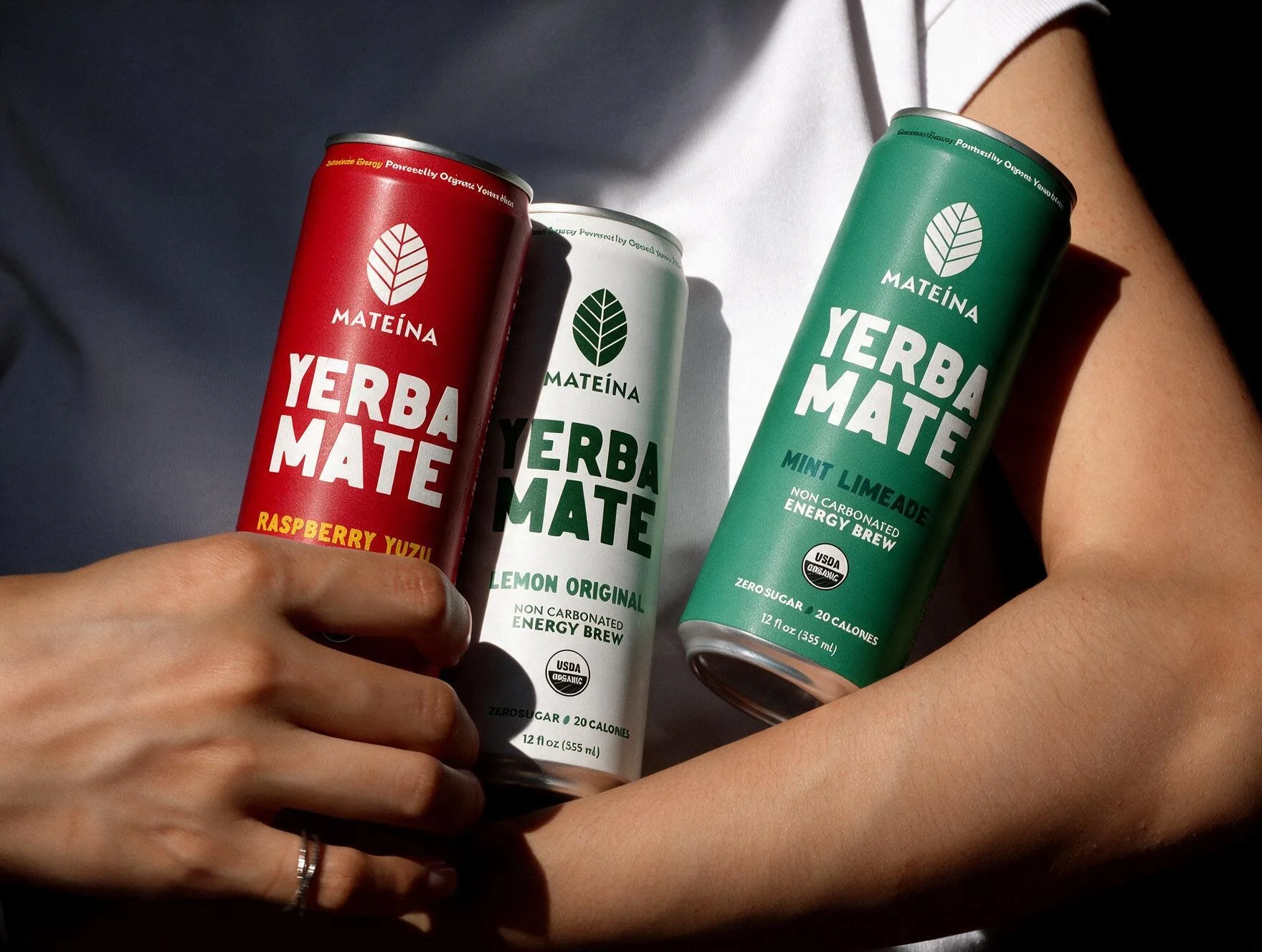
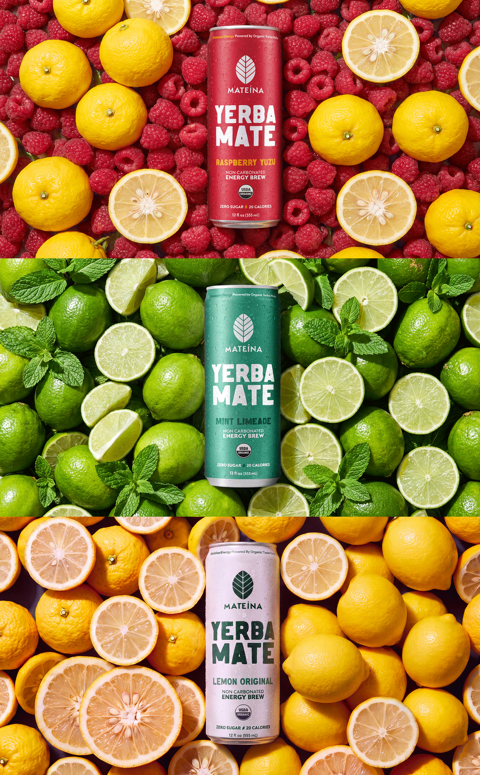
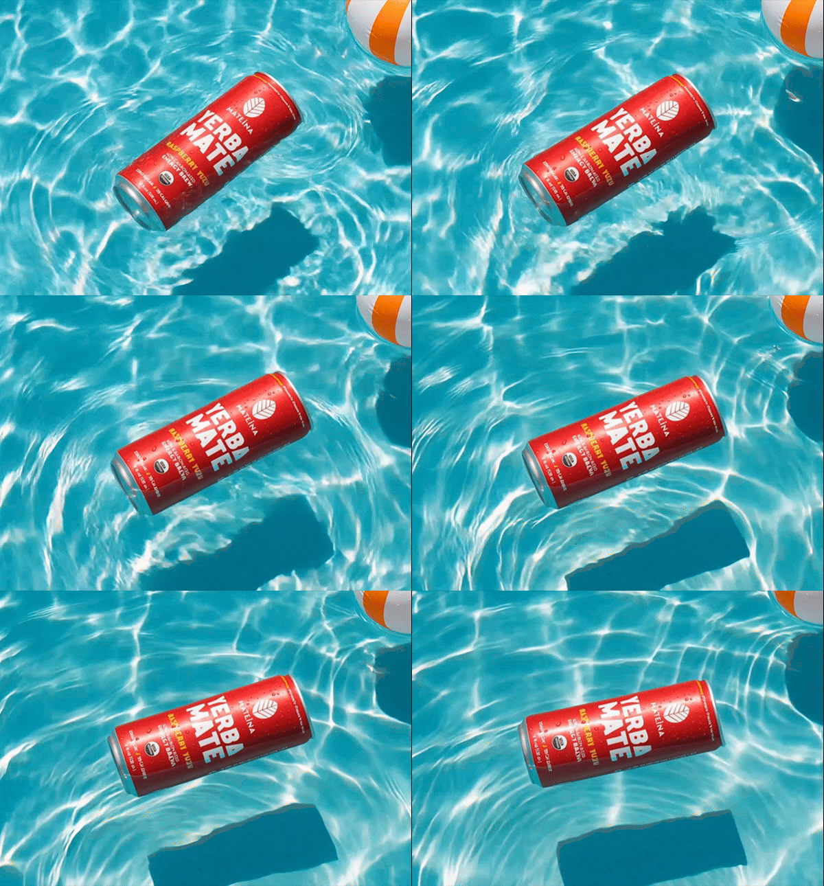
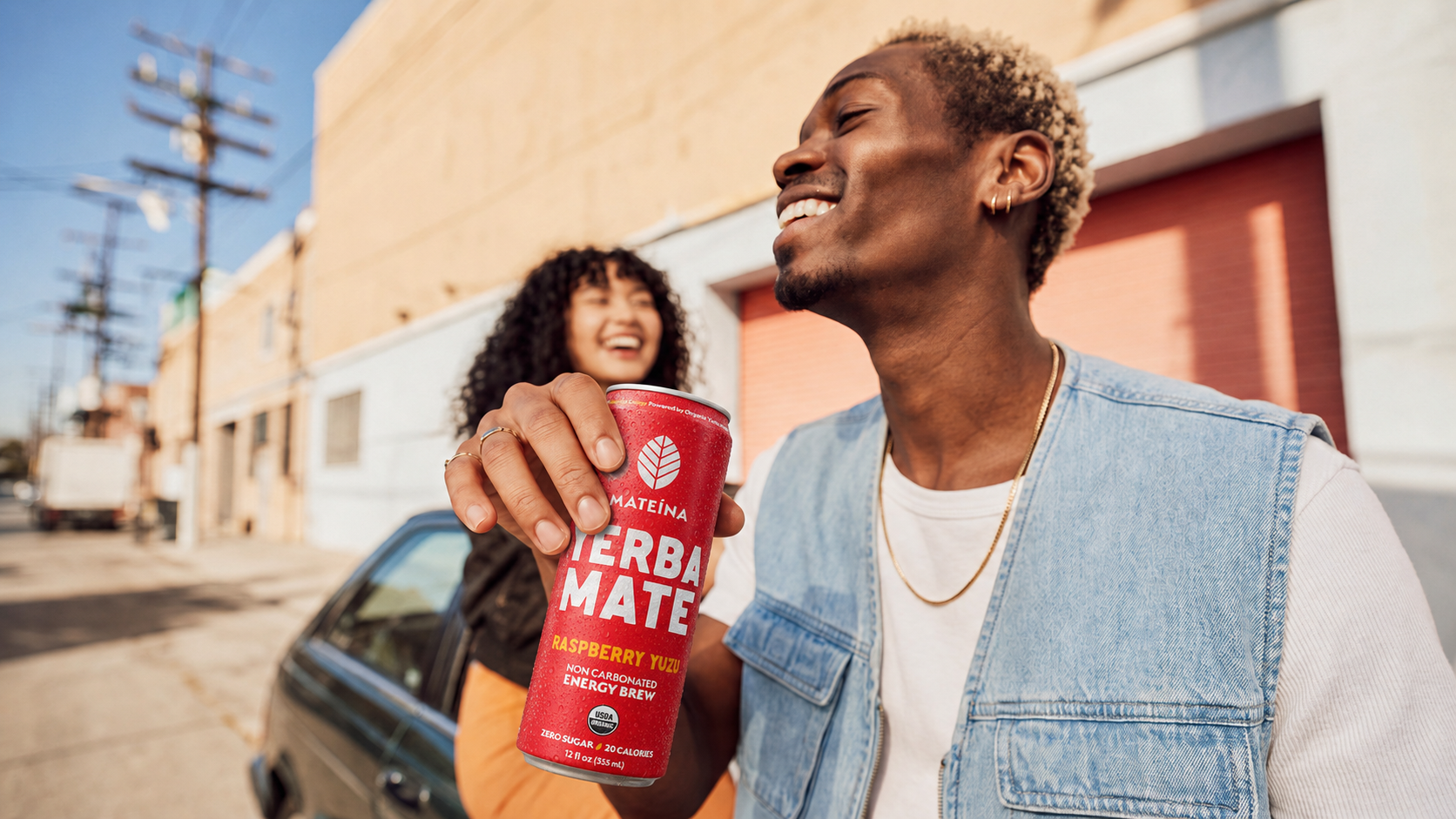
With a growing lineup of flavours, I needed the packaging to feel unmistakably Mateina while making each product easier to recognize at a glance. I refined the range with stronger flavour differentiation, clearer hierarchy, and a more consistent visual language, giving every can its own personality while keeping the brand cohesive.
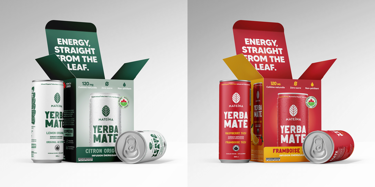
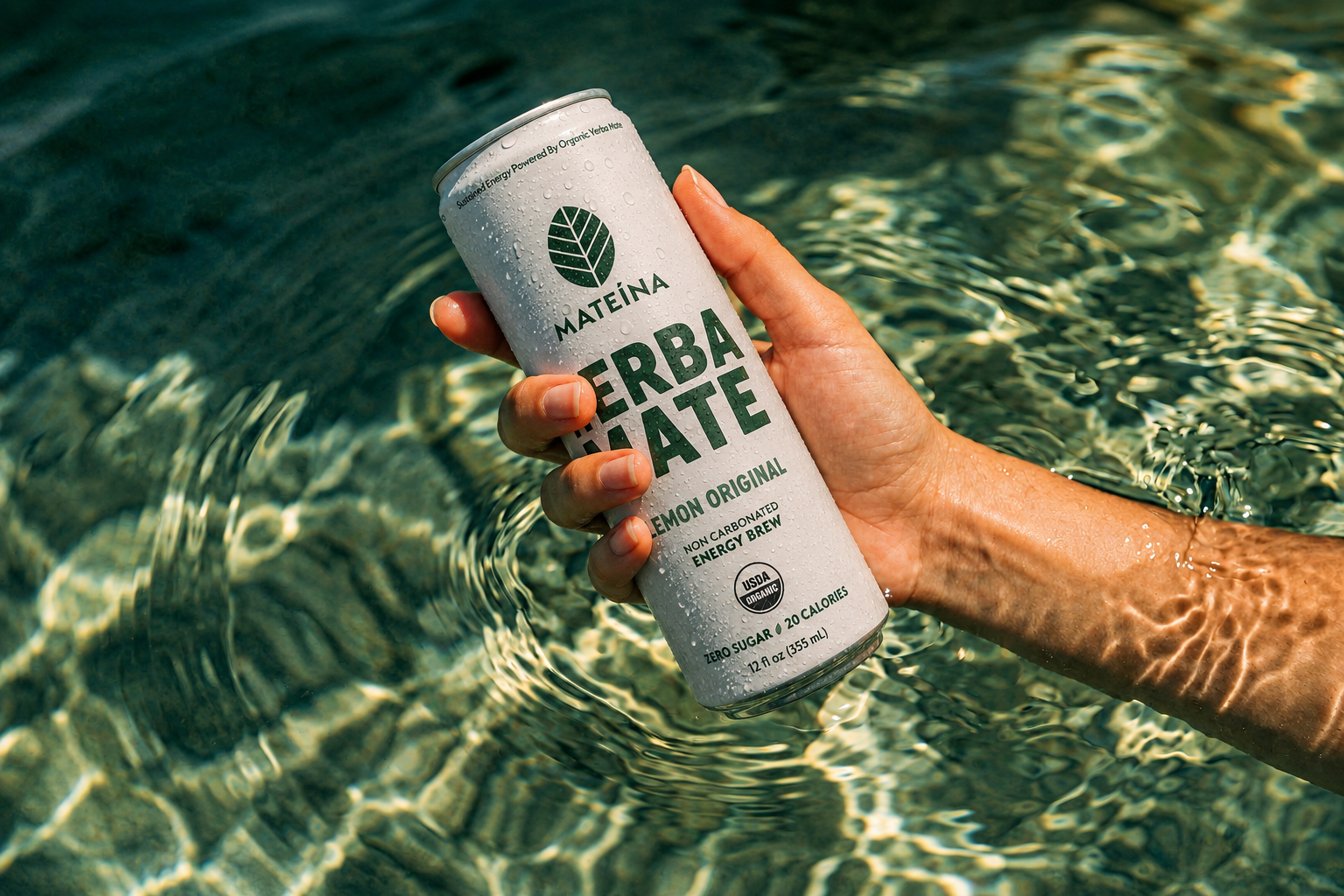
With a growing lineup of flavours, I refined Mateina’s packaging system to make each product easier to recognize while keeping the brand unmistakably consistent. I strengthened flavour differentiation, clarified the hierarchy, and created a more cohesive visual language across the range, giving each can its own personality while keeping the lineup connected.
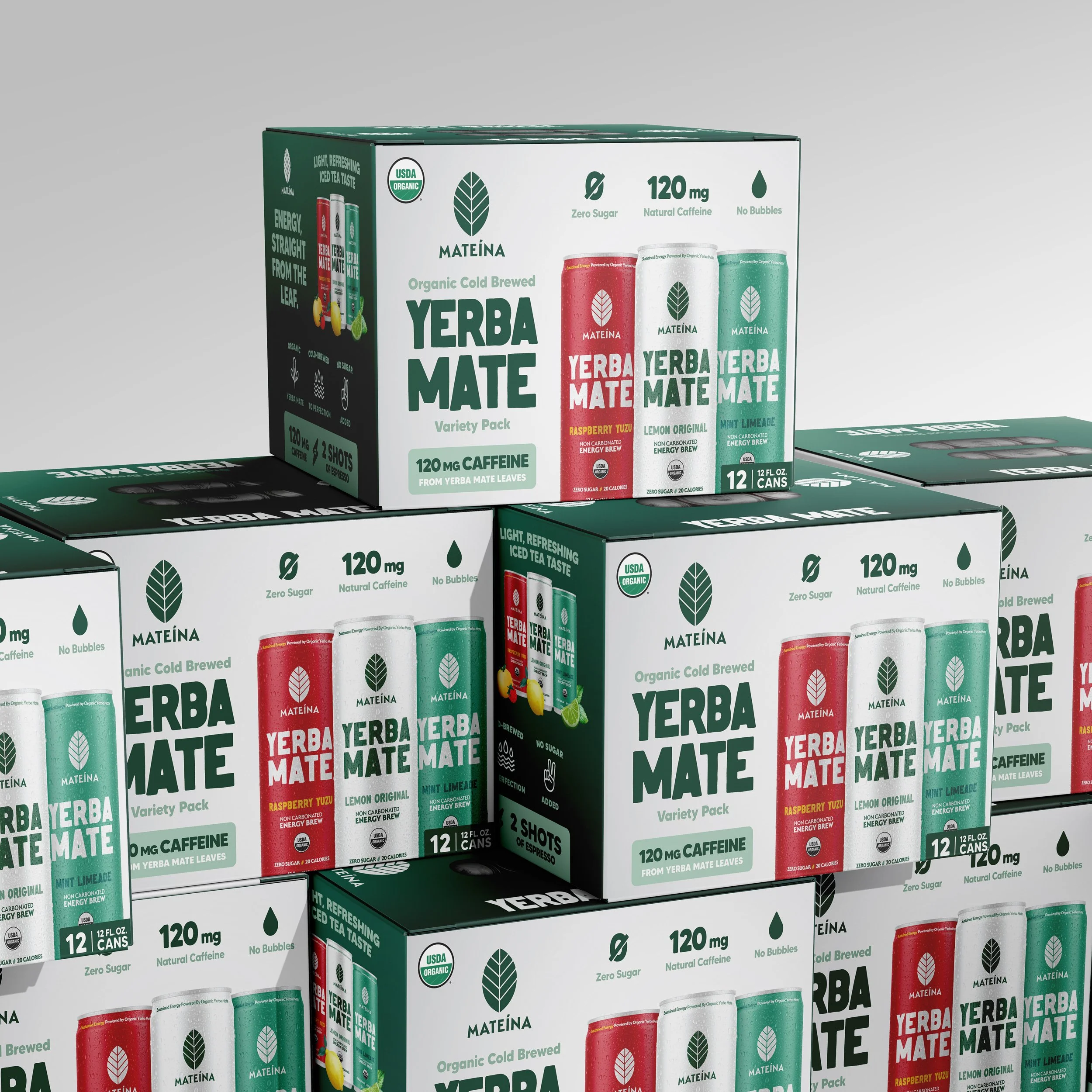
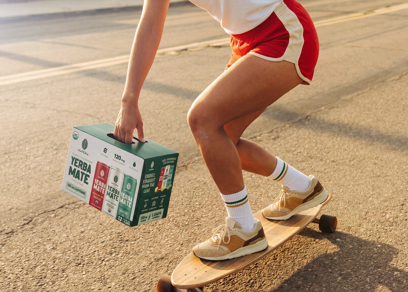
I designed for the regular shelf first, then took the brand into Costco. Getting into Costco Canada meant rethinking how Mateina would show up at a much larger scale, where the multipack needed to communicate the brand, product, and flavours instantly. I adapted the existing visual language for the club environment, keeping it unmistakably Mateina while giving the packaging the impact it needed to stand out. Same brand. Bigger shelf.
I wanted the Costco launch to do more than build recognition. I created social content that used Dr. Andrew Huberman’s connection to yerba mate as a way to introduce Mateina to new audiences, including people who may not have known the brand or the category. The goal wasn’t just to feature a familiar face. It was to turn that familiarity into curiosity and give people a reason to discover Mateina.
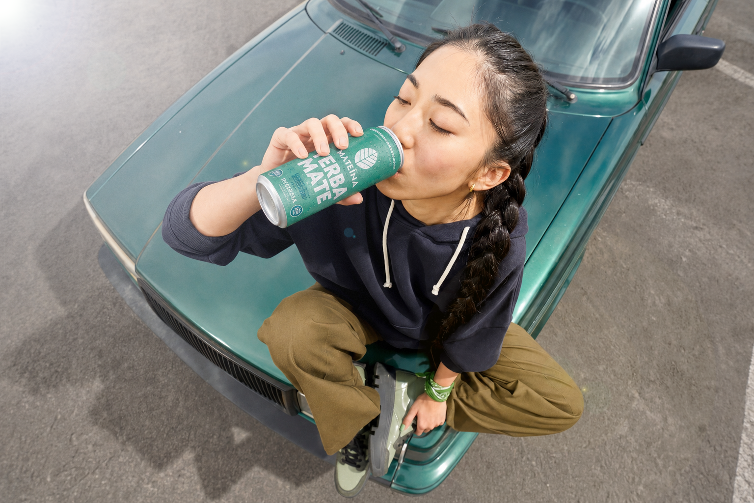
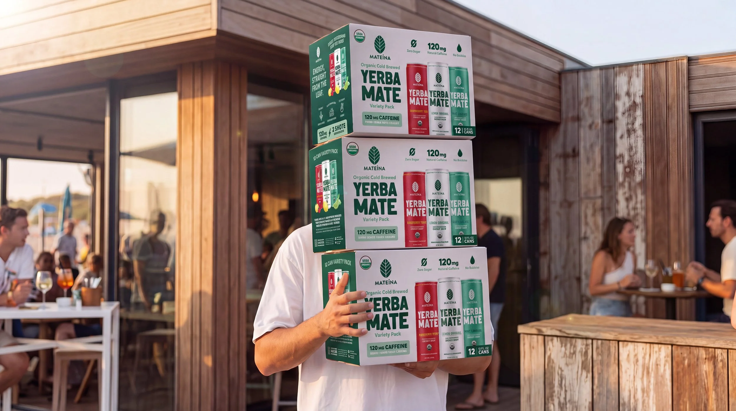
The Costco Canada launch was a success. Costco then asked to create a version for Costco USA. I adapted the packaging system for the American market while keeping the visual equity established in Canada. One retail concept. Two markets. A system built to travel.