Bulletproof Logistics lives to keep your products safe from when they leave your hands to when they reach your customers worldwide.
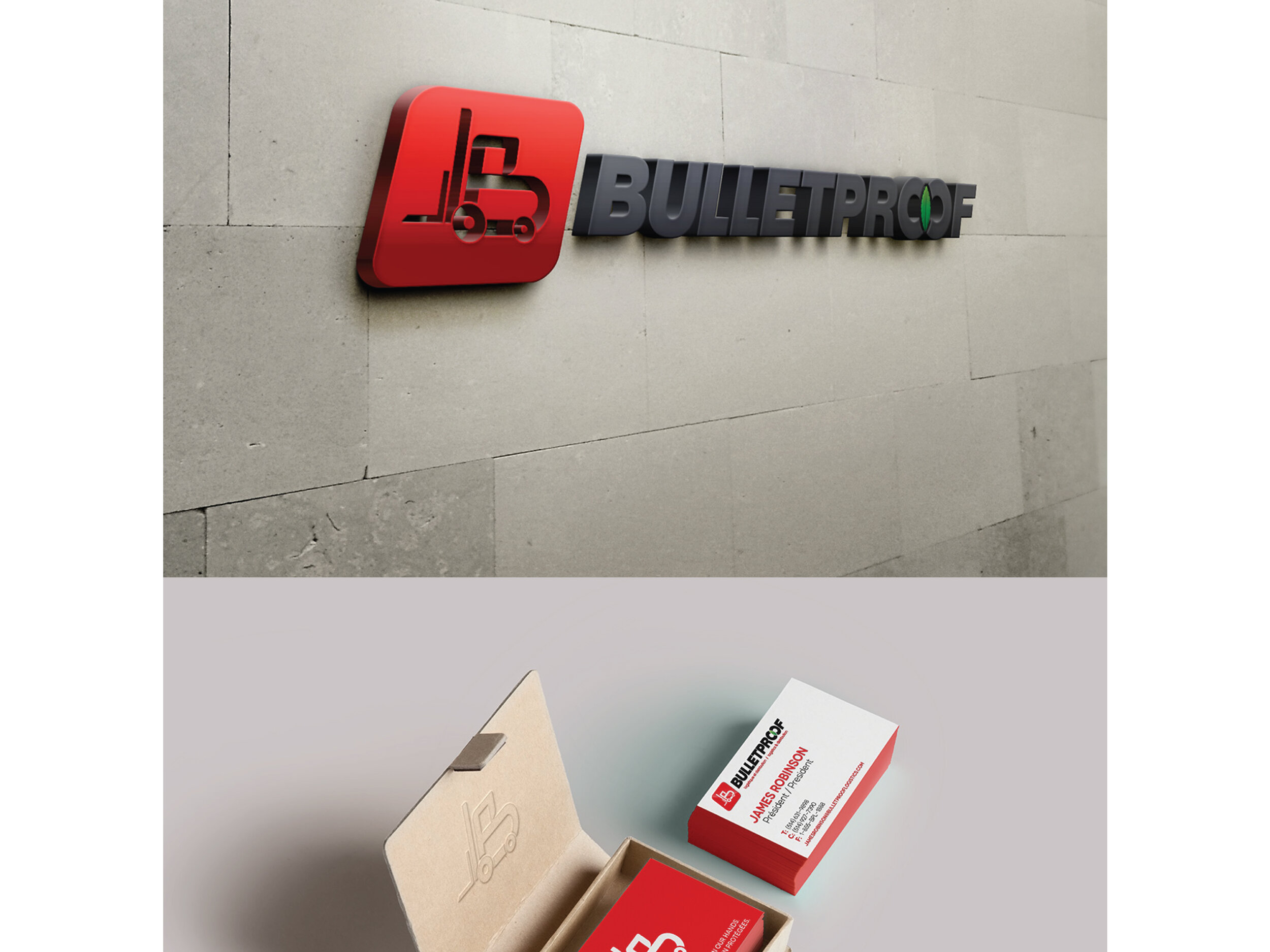
BRANDING — LOGO — SIGNAGE
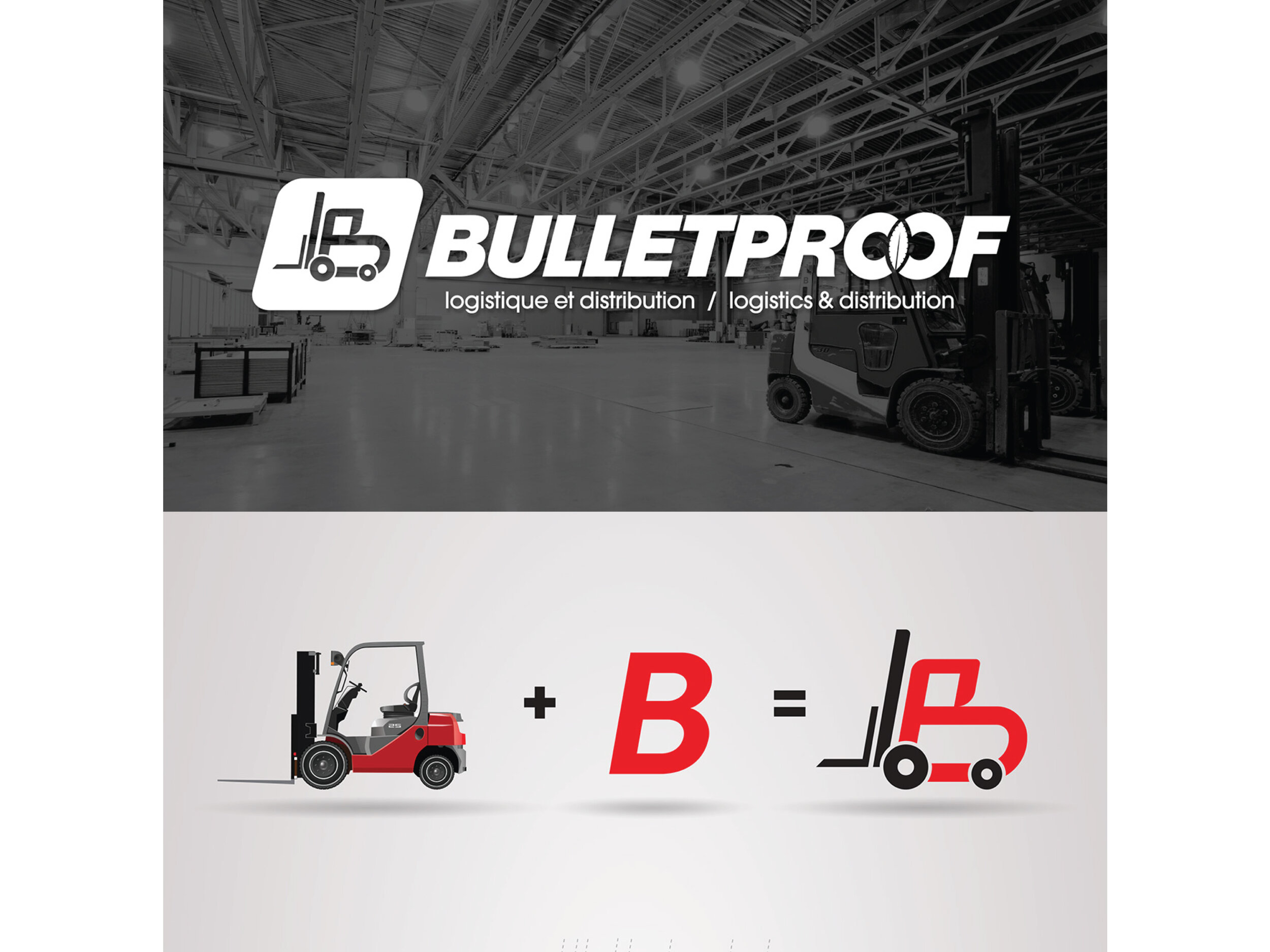
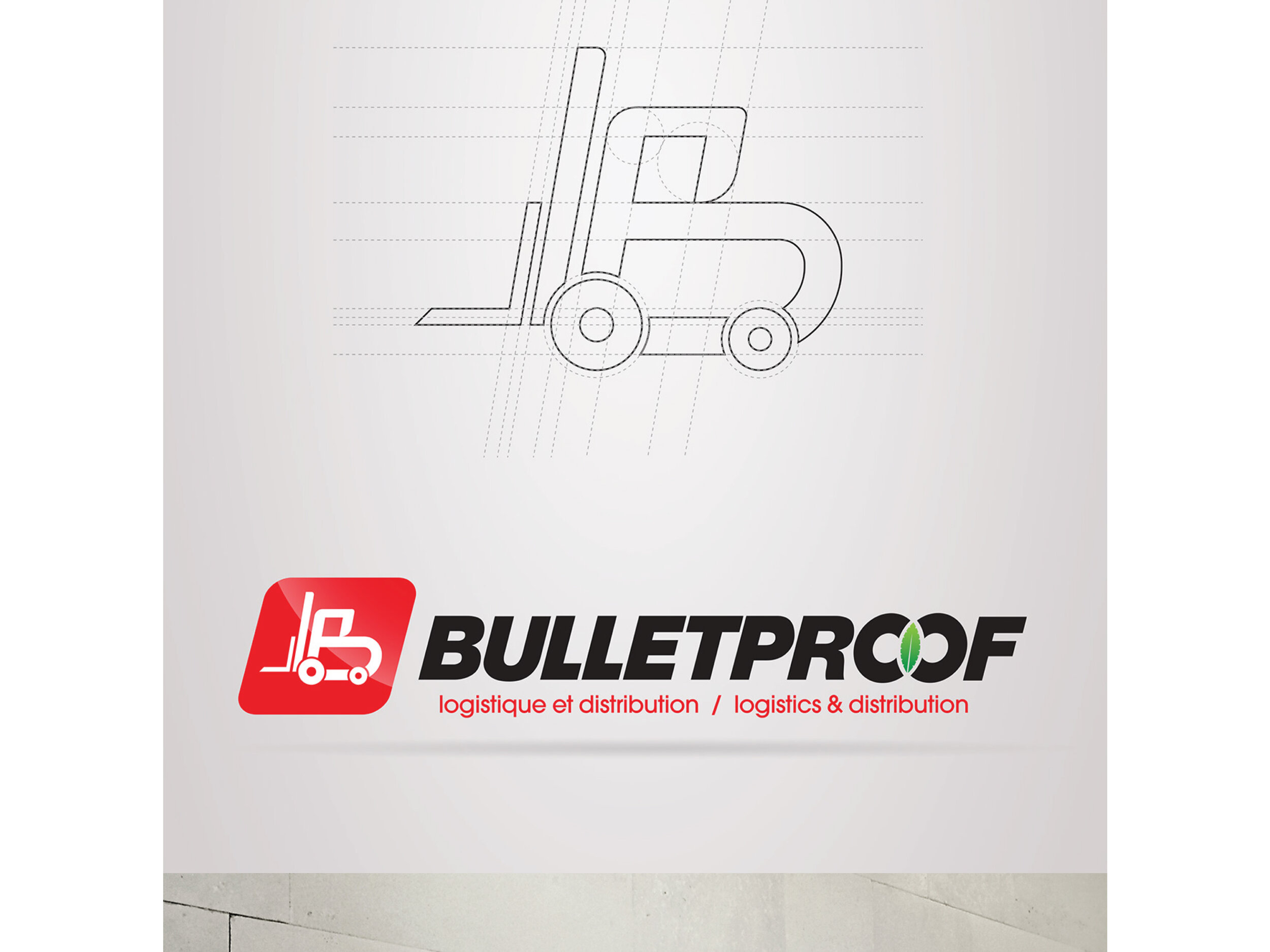
The company contacted us because it felt the need to give the brand a total refreshment and a new visual structure. Giving way to an aesthetic, reliable, functional brand that will last over time. The logotype is based on a typographic trick blending the letter B with a forklift. Being able to capitalize on a short, identifiable, memorable logo.
![Website_Image_Layout-01.jpg](https://images.squarespace-cdn.com/content/v1/5f242a581b4b0e05309773c6/1596566793246-FDWPHOSA58PZW2NAWX4K/Website_Image_Layout-01.jpg)
![Website_Image_Layout-02.jpg](https://images.squarespace-cdn.com/content/v1/5f242a581b4b0e05309773c6/1596566791366-H9OVG0ZCFHTY4CYTCHHC/Website_Image_Layout-02.jpg)
![Website_Image_Layout-03.jpg](https://images.squarespace-cdn.com/content/v1/5f242a581b4b0e05309773c6/1596566793820-O78UUJC46LHNRUXGD7E4/Website_Image_Layout-03.jpg)
![Website_Image_Layout-04.jpg](https://images.squarespace-cdn.com/content/v1/5f242a581b4b0e05309773c6/1596566787961-FT0XUS3Y7QSUKYX6GGDD/Website_Image_Layout-04.jpg)